Mckenzie Sampson’s daughter was two or three when he was developing Harmonic Riff, his first kit for the Canyon-SRAM women’s WorldTour team.
She would sit on his lap while he worked and play with the colours. When the first fabric swatches arrived, she would wrap them around her shoulders like a cape and run through the house. Later, the team sent her an extra-extra-small jersey, which she wore while they watched the races together.
“That’s my team, that’s my team,” she would say whenever Canyon-SRAM appeared on the screen.
Latest Videos FromCycling Weekly
For Sampson, the moment became a grounding point through the late nights and endless revisions.
“This is what I’m designing for,” Sampson says. “Seeing that [jersey] on her and her excitement…it’s so powerful to have.”
To the viewer, a cycling kit flashing by at 50 kilometres an hour can register as little more than colour, logos and a quick means of identifying one team from another. To Sampson, an apparel designer who has spent 17 years designing kits, a good jersey should do far more.
It should tell a story.
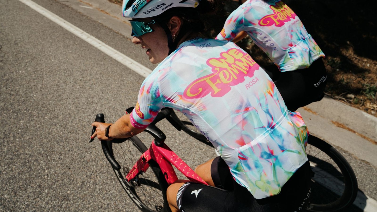
At this year’s Tour de France Femmes avec Zwift, the Canyon-SRAM story is being told in white, pink, blue, orange and green. The team’s switch-out kit takes Sampson’s Luminous design—a graphic inspired by light refracting through coloured glass—and places it on a bright white base, with a “We Femmes” wordmark stretched across the chest, back and sleeves.
The design carries two stories at once.
The first is a decade of Canyon-SRAM, which entered the peloton in 2016 as a women’s programme in its own right rather than an extension of a men’s team. The second looks beyond the professional peloton. We Femmes is built around a global invitation: those who already ride should bring along a woman who does not. It’s Canyon’s promise to bring at least 1,000 women a year to free rides and events over the next decade.
On the jersey, with its bold colours and font, that phrase feels more like a statement: we, women, belong here.
Sampson is quick to point out that the Tour-specific wordmark isn’t his design, but he does very much approve of its attitude.
“The wordmark wasn’t actually done by me, but I kind of dig it,” he says. “It’s a little punk rock, and women’s cycling is a little punk rock, you know?”
A story, built in layers
(Image credit: Canyon-SRAM)
The white switchout kit has had little trouble being seen. After six stages, Kasia Niewiadoma-Phinney sits third overall, 1:17 behind yellow jersey Marlen Reusser (Movistar). The 2024 champion is chasing a fifth consecutive podium and a second overall title.
Asked whether he is biased because he designed the kit she wears, Sampson laughed.
“I’m going to say yes, definitely,” he says. “But I think it’s a mix of her as a rider, her as a person, and she’s an incredible style icon of cycling.”
Long before a kit reaches a rider’s shoulders, however, it has to survive a much slower and less glamorous process: trend research, story concepts and discarded designs; technical fabrics and print tests; sponsor requirements and rider fittings; and the awkward geometry of turning a flat graphic into something that works both standing still and moving at race speed.
To that end, Sampson considers himself a product designer first. His primary experience is in performance clothing; the graphics often arrive near the end, “the last little bit” that turns a functioning garment into something people notice.
These days, riders at the highest level receive garments that were specifically tailored to them, rather than the more generic sizes available to consumers.
It is an easily overlooked but significant marker of just how far women’s cycling has professionalised. But for the designer, that creates another challenge: the artwork must remain coherent even as the cut and proportions change from one rider to another.
And the jersey is only one piece. Between racewear, helmets, accessories and off-the-bike clothing, Sampson says a complete collection can contain as many as 65 individual pieces.

The 2024 “Harmonic Riff” kit form CANYON-SRAM
(Image credit: Canyon-SRAM)
In this story:

(Image credit: McKenzie Sampson)
McKenzie Sampson, an apparel designer who has spent 17 years designing kits, including some of the fan-favourite Canyon-SRAM kits.
The process starts with the team: its riders, their energy and the limits imposed by sponsors and brand colours.
“I’ve been really fortunate to be a part of some of the most interesting teams, I think, within Specialized and with Canyon,” Sampson says. “The teams themselves have really been the key factors in allowing those designs to come forth. Canyon specifically has been an interesting point where [the design] just needs to be bright and bold and powerful and have a certain level of energy that the riders emit.”
A cyclist himself, Sampson understands how a kit should fit and move. His inspiration, though, comes from far beyond road racing. He grew up around skateboarding, snowboarding and wakeboarding, then designed kits for his University of Oregon team before landing roles at Adidas and Specialized. His later work includes Boels-Dolmans, Pete Stetina, Canyon’s off-road programmes and Canyon-SRAM.
His inspirations might come from fashion forecasting, skate and snowboard graphics as well as the world around him. He gathers textures, colour treatments and visual elements, then begins building in layers: gradients, graphic elements, branding and the story intended to hold it all together.
A team might settle on a concept in three or four attempts, or run through 10, 20 or even 100. Sampson filters them to two or three options, presented from “mild to wild.”
Luminous began with coloured light refracting through the stained glass of a Gaudí cathedral in Spain. Harmonic Riff began with music, translating sound, rhythm and vibration into undulating gradients.
“I like to build a story around the design,” Sampson says, giving it “a little more meaning and a little more depth than just being cool for cool’s sake. The more depth and story and meaning you can put behind your design, the better.”

The white switchout kit has had little trouble being seen. After six stages, Kasia Niewiadoma-Phinney sits third overall, 1:17 behind yellow jersey Marlen Reusser (Movistar). The 2024 champion is chasing a fifth consecutive podium and a second overall title.
(Image credit: Getty Images)
The white Tour kit was a hit from the start. It was designed first and impressed when the initial swatches were printed, but the darker blue-purple version felt like a stronger option for year-round.
“There was something unique about the darker blue kit that just felt interesting and powerful and like a really strong starting point,” Sampson says.
White was saved for the Tour, where its lighter base also serves a practical purpose in the summer heat.
“Keeping the riders cool is always a huge factor,” Sampson says. “It’s not just the meshes, but also the colours included.”
Canyon-SRAM’s kits have historically been a fan favourite, and Sampson says he loves seeing the kits out in the wild. But he also knows they can be divisive.
“Graphics in general are polarising,” he said. “Whether you love them or hate them, they’re always going to be polarising.”
The final result is never the designer’s decision alone. Teams, sponsors, manufacturers, materials and performance requirements all have an impact. As Sampson put it, laughing: “If the design sucks, it’s probably not always the designer’s fault.”
Explore More
